I’ve always loved drawing, sketching, doodling, in any medium available - and since I bought my first iPad I’ve been fascinated with digital drawing and the endless possibilities it offers to an illustration artist.
So far I’ve learned a lot of tricks and shortcuts in Procreate that make the illustrating process easier and faster, which for me was the main advantage of digital over analog. What I’ve also learned is that all that extra time not spent tediously colouring vast surfaces by hand or carefully planning the correct order of painted layers wasn’t contributing much to my speed of drawing - au contraire, I became slower and pickier, endlessly erasing (undoing) the tiniest of details, correcting every slightly crooked curve and deleting every pixel of colour that fell outside the line. The result was often an overdone, over polished illustration that lacked the energy and the unpredictability of hand drawing.
Now I have a new challenge - I want to develop a digital style of illustration that more closely resembles my sketches and drawings done in traditional media. Here is my process:
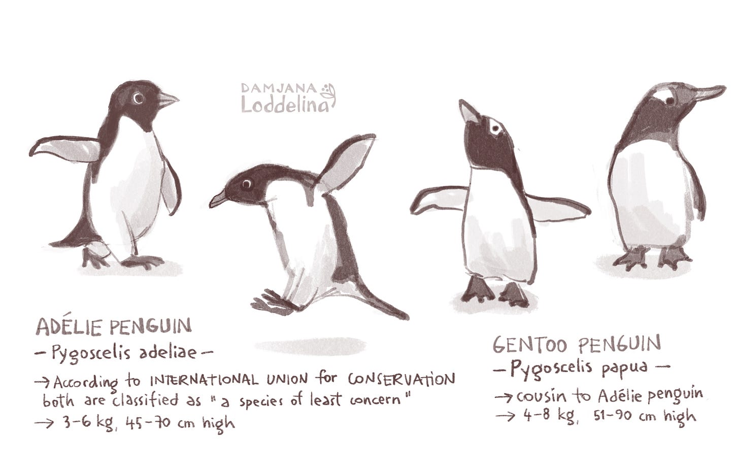
I’ve been working on some penguin characters for my portfolio and a possible picture book idea. I started by researching different penguin species and their specific characteristics and decided on these two cousin types, Adélie and Gentoo penguin. First I made some realistic sketches following photo references.
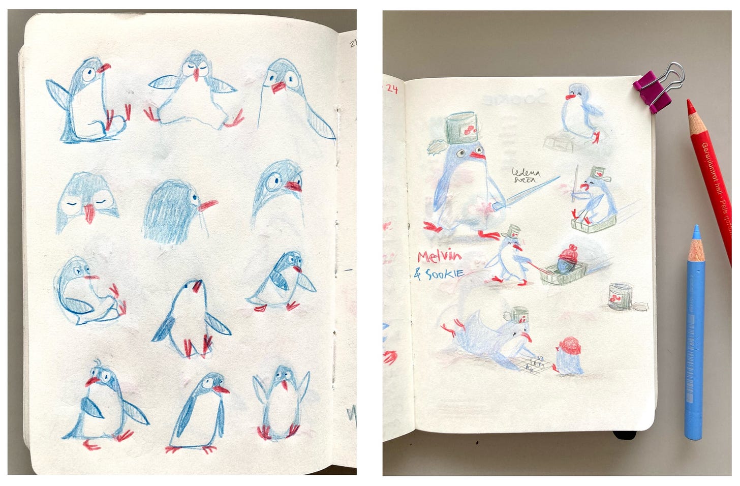
Then I tried simplifying these, drawing more loosely, from memory, to create a picture book character penguin. I like to sketch in pencil or coloured pencil, using inexpensive sketchbooks, just loosely drawing without worrying about the final result, that’s when most spontaneous results happen.
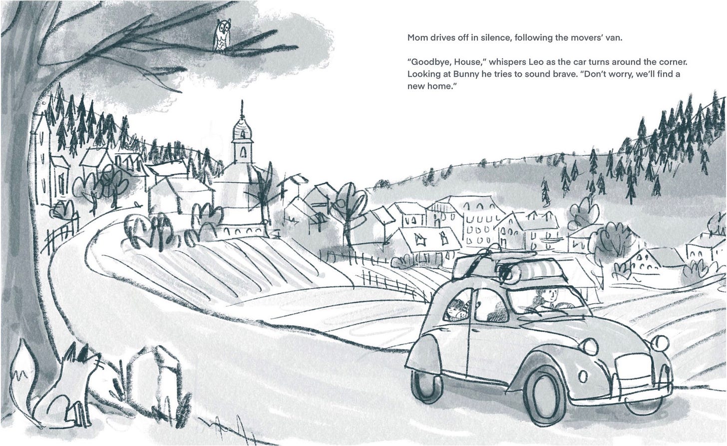
In the next stage I brought paper sketches into Procreate (I just took pictures of sketchbook spreads with my iPad and used whichever drawing I found most interesting). To imitate paper sketchbook I like to use simple, organic looking brushes, mostly 6B pencil and gloaming brush from the basic Procreate brush sets. 6B pencil is great for outlining and I use smudgy gloaming brush for quickly colouring in the shapes. This is also how I draw rough sketches for picture dummies (below is a book dummy spread from my author PB Goodbye, house)
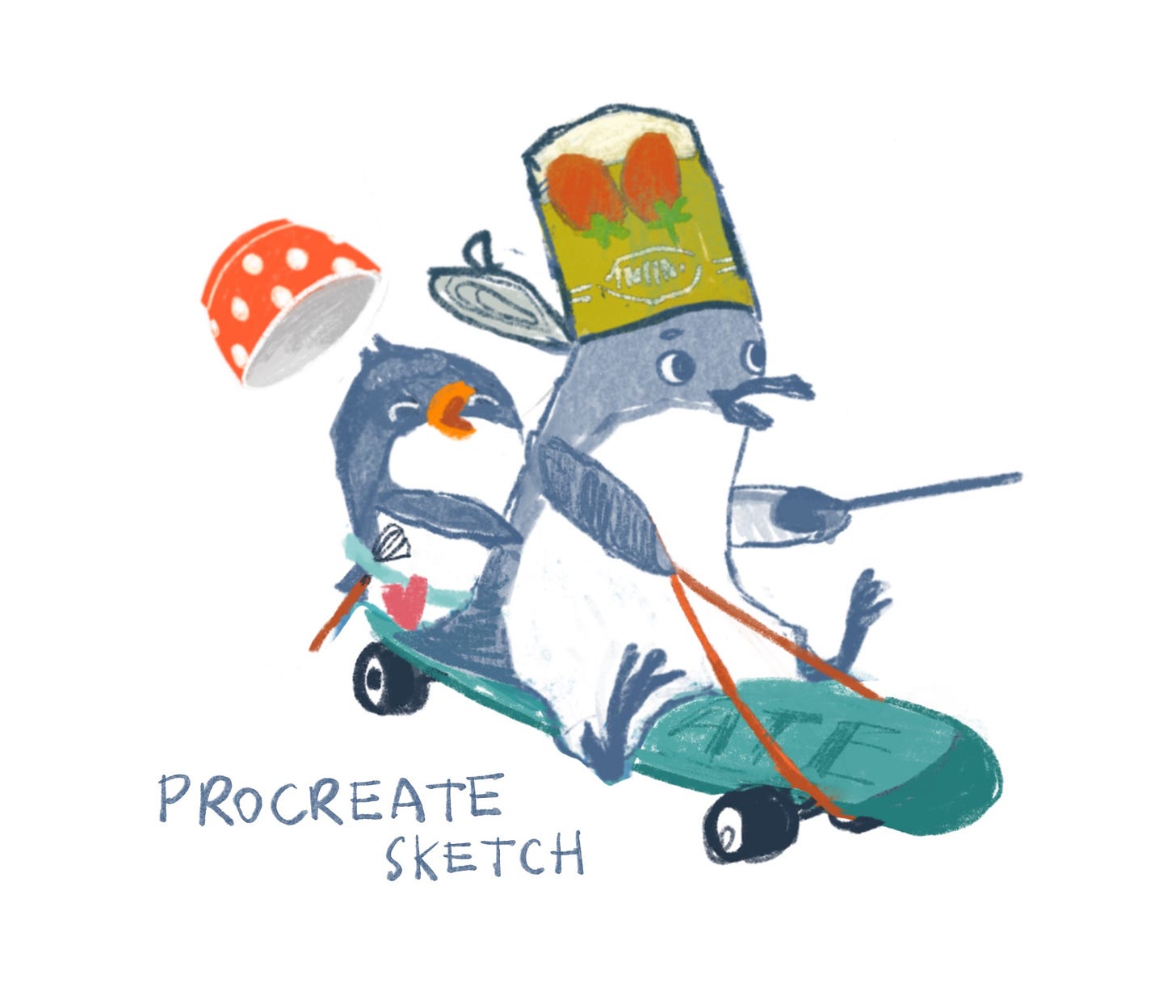
But back to my penguins, who were now turning into a couple of siblings, big brother and little sister, playing together. Here’s one little scene, sketched out with some added colour to test the final palette and see what goes well with “penguin grayish blue”…
At this stage I wasn’t too bothered about the exact proportions or perspective, just trying to catch the right facial expressions and the siblings’ interaction. I made some small adjustments and once I was OK with the whole composition I lowered the opacity of the sketch and drew a “cleaner” final version on top.
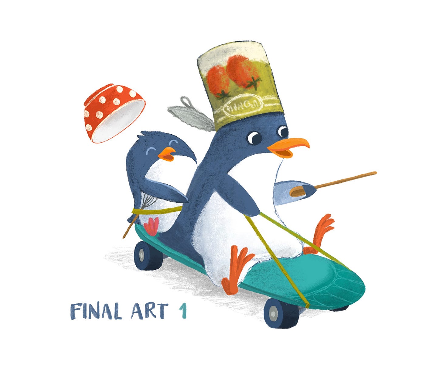
But I wasn’t happy with result No. 1: it looked too smooth, the scruffy lines of my first sketch became too clean and previously random texture was now too controlled. Somewhere in the drawing process my mind switched back to realistic sketches of Adélie and Gentoo penguins instead of keeping the loose, messy lines of penguins from my imagination. Final art looked quite flat and static compared to the energy of the sketch.
What to do, how to keep the charm and originality of my rough sketches but also add lush colour and dimension to my final art? I had to find a happy compromise.
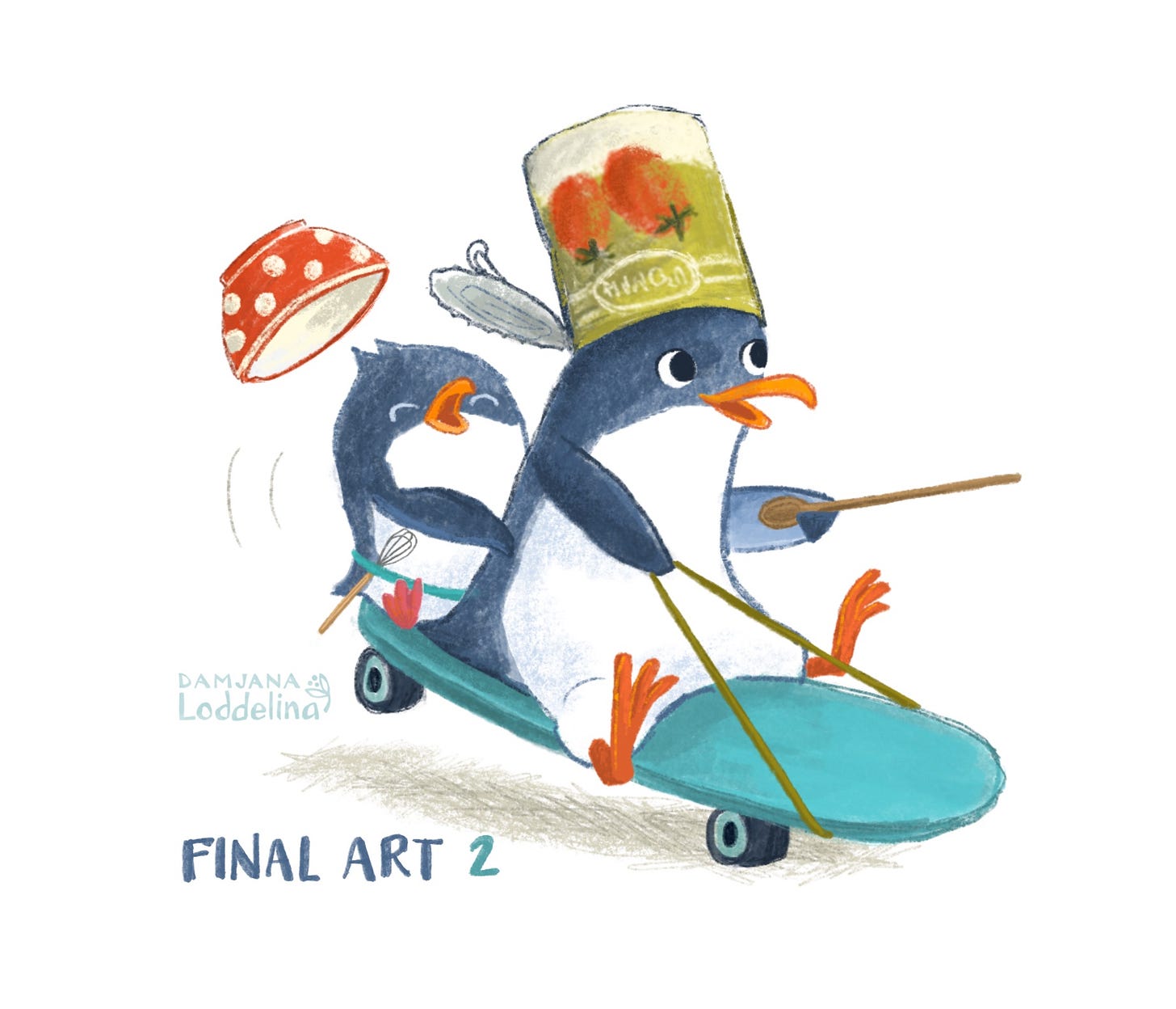
So I tried again, keeping as many of the clunky lines and unevenly coloured surfaces as I could, slowly erasing the unwanted pixels rather than constantly clicking the undo button… and here is the result:
So have I found the happy middle? Which version of the final art do you prefer and what is your best tip for creating digital art with an analog look? The challenge continues…
This post is part of the monthly illoguild question. This month we focus on Process.
Join the illoguild next Monday, June 17th, when we talk about process for a range of topics, such as picking a color palette, organizing projects into manageable chunks, keeping characters consistent, and so much more. We can’t wait to see you there!


I also find it helpful to erase rather than undo. It helps preserve the analog spontaneity I think. Also, one of my favorite tricks is to add a very slight color jitter to my favorite brushes. It gives the illustrations a more traditionally painted look with the subtle shift in color 🙂
It's lovely to see some of your process. Number 2 definitely has more life and personality in it! 👌 Amazing how much difference there is between the two. 🤩