


Inspiring picture book spreads
Timeless illustrations to admire and learn from

Each month the illustrators, members of the IlloGuild are answering a question together, and October theme is: What spread from a picture book inspires you the most?
How can I single out just one spread among so many beautiful picture books that are being illustrated every year, it’s impossible!
I will nonetheless try to show you some variety of vintage and modern, to illustrate (pun intended) how the language of images is universal and timeless.
The first two spreads are from one of my favourite childhood books, with original title Ein Wald und Schweinchen Jo (The Forest and Piglet Jo, 1968) by Ingeborg Feustel, illustrated by Eberhard Binder (my copy, published in Slovene, is from 1971).
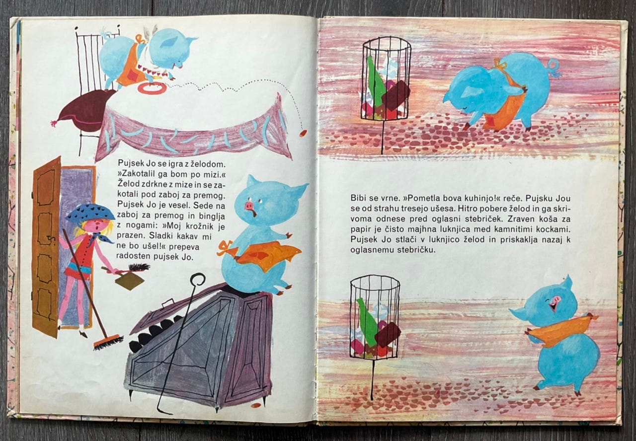
A girl named Bibi and the little piglet Jo live in the middle of the city, inside an advertising column (!) and every morning Bibi serves Jo acorns for breakfast. Jo hates acorns but without finishing his plate he doesn’t get his cup of hot chocolate… so he tries to hide the acorns around the house but Bibi might find them (she’s a bit of a clean freak). He instead puts them in the pocket of his apron (how cool is a blue piglet in an orange apron!) and takes them outside where he pops them into the cobblestone cracks all around the advertising column.
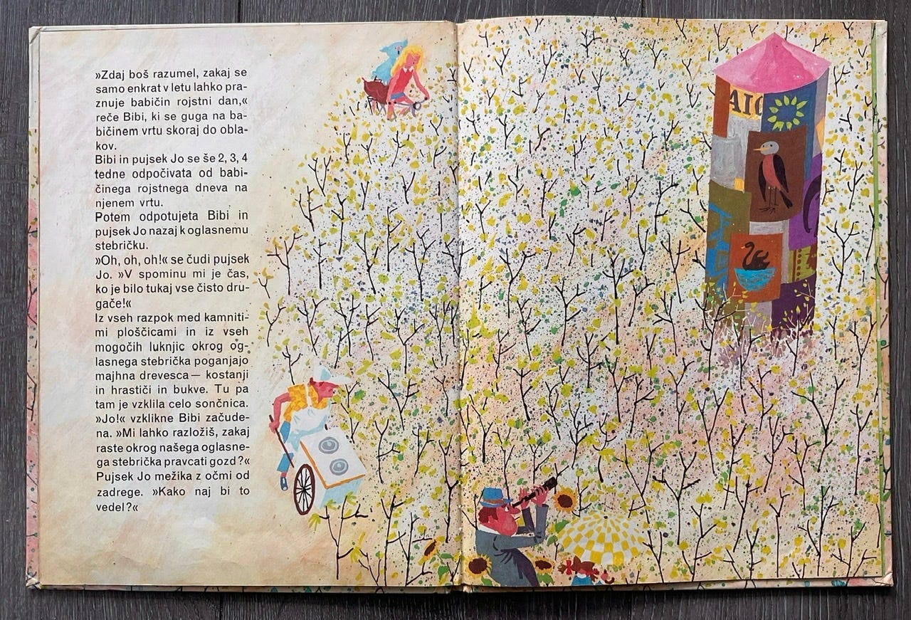
The letter arrives, Bibi’s grandma is inviting them to the countryside for a long visit. After a while they return and …
… they can’t believe their eyes: a forest of tiny young oak trees has sprung all around their home! Jo’s secret is out but Bibi finds a solution - they replant all of the trees in a local park, creating a little forest that will become Jo’s responsibility to water and take care of.
So why do I love these spreads? Aside from the fact that as a child I found living in a colourful advertising column fantastic, I admire the simplicity of this first spread, describing a complex environment but using only the most essential elements, everything else is left to the child’s imagination:
The open door with the piglet sitting on a coal bucket clearly pictures a kitchen without having to show every detail, so the eye can focus on that pesky little acorn piglet has hidden under the box. The cobbled street is very simplified but the child immediately recognises it’s a city street because of an outdoor type waste bin on a stand.
The second spread is a wonderful bird eye view of Jo’s mess, it shows the ridiculousness of the whole forest of oaks obstructing the town’s daily life and even attracting tourists… Simple, with very few elements, but again very effective.
My second pick are two spreads from a much more recent book, La biblio d’Orazio (Orazio’s travelling library, 2022), by Davide Cali, illustrated by Sébastien Pelon.
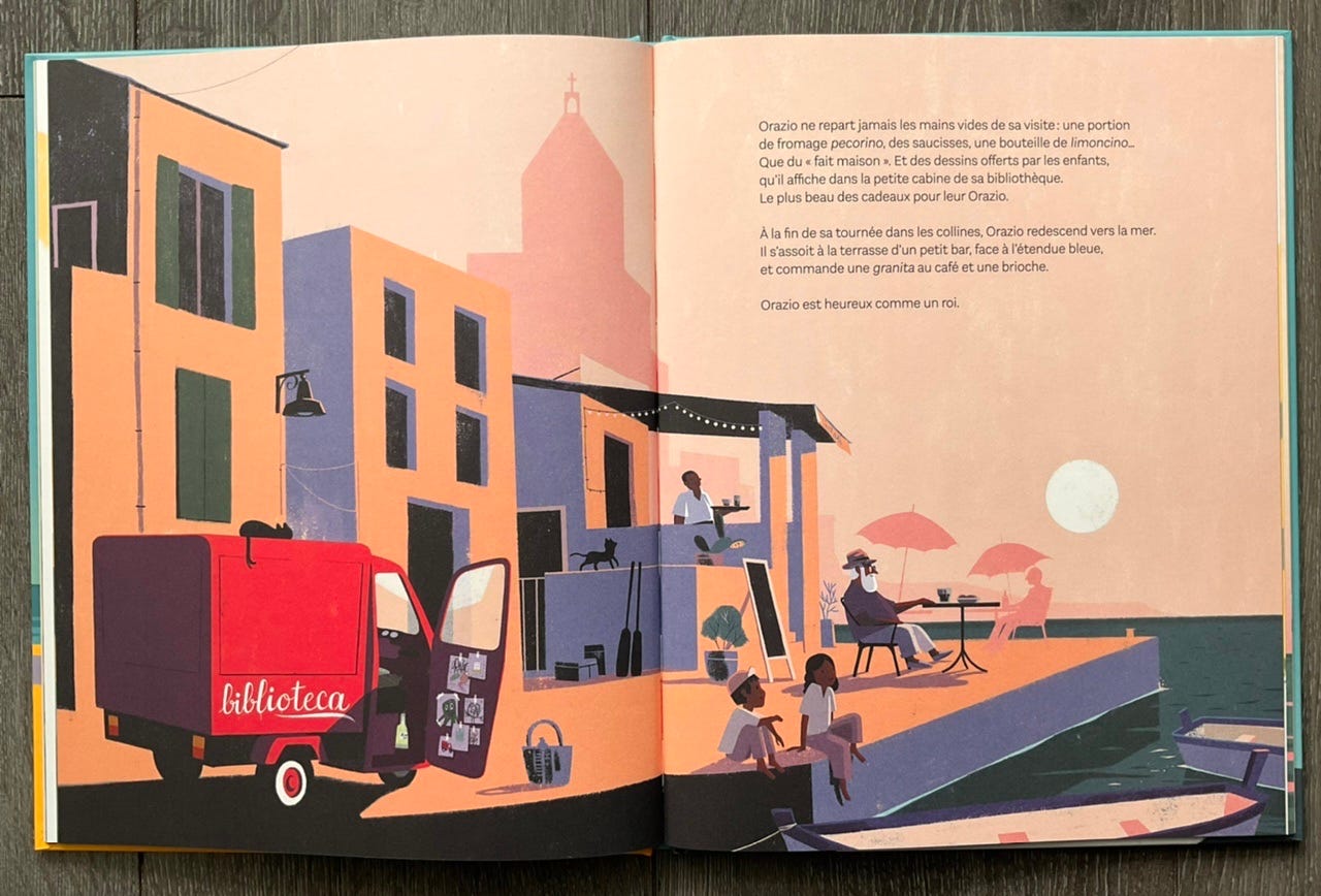
The story is set on the island of Sicily where a retired schoolteacher Orazio buys an old fruit and veg van and transforms it into a travelling library, bringing books and joy to the people in remote villages.
The first spread shows Orazio enjoying a drink after another hot day - the flat digital image is relying on the colours to tell the story - hazy peach sky and long, blueish shadows suggest a late summer afternoon sun and the whole tranquil scene is wrapped in the same palette except the main character, a bright red van.
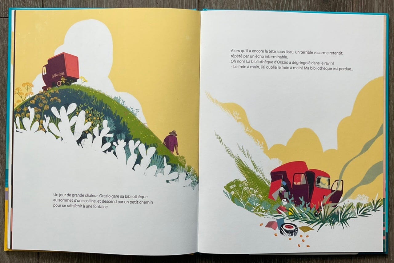
Tranquility is over when, on another hot day, Orazio stops to refresh himself at the fountain and the van rolls down the hill and crashes.
Here the bright yellow sky emphasises the scorching hot sun that forces Orazio to park his van, and the white space cleverly eats into the image, creating additional layer of texture and perspective. This flat, digital style is using colour and contrasts, simple shapes and negative space in the most effective way.
Which picture books are your favourite and what can you learn from their colour and composition?
Visit the IlloGuild page to see how other IlloGuild members answered this question!
It's such a joy to look at some vintage spreads! Great idea